
如何使CSS网格保持设置大小而不管条目?

我有一个CSS网格,随着时间的推移,它会使用JSP慢慢填满条目。网格本身有一个背景色,条目在网格内有自己的颜色。问题是网格随着条目的添加而增大。我希望网格背景保持设置的大小,并在添加条目时在其中弹出(我在服务器端设置了最大条目限制,所以不用担心)。
这有可能吗?我在下面包含了一些图片:
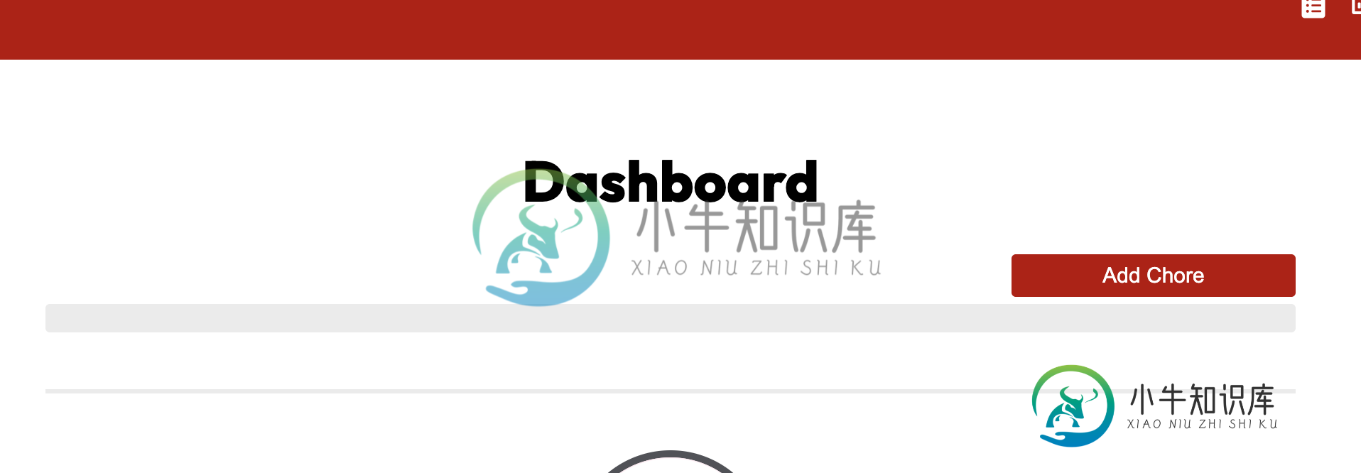
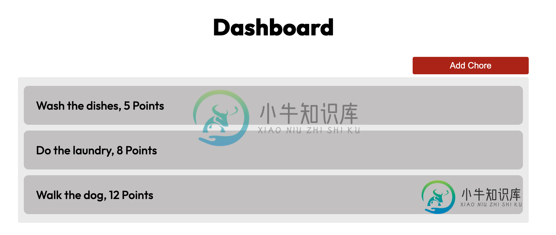
与上面的图片不同^^我希望我的仪表板网格始终固定为某个大小,并让这些条目显示在仪表板内部,然后超时填充。
HTML
    <div class="chore-container">
        <c:forEach var="chore" items="${data}">
            <div class="chore">${chore.name}, ${chore.points} Points</div>
        </c:forEach>
    </div>
CSS
.chore-container {
  display: grid;
  grid-column-gap: 50px;
  grid-template-rows: auto auto auto;
  background-color: #ebebeb;
  padding: 10px;
  margin: 0 250px 0 250px;
  border-radius: 3px;
}

.chore {
  background-color: #c2c0c0;
  border: 1px solid #c2c0c0;
  padding: 20px;
  font-family: Outfit, sans-serif;
  font-weight: 500;
  font-size: 20px;
  text-align: left;
  margin: 5px 0 5px 0;
  border-radius: 8px;
}
共有2个答案

这里有一个潜在的解决方案...主要是flexbox和一点绝对位置,否则你最终会有两个滚动条。
    body {
      font-family: sans-serif;
    }

    .container {
      display: flex;
      flex-direction: column;
      position: absolute;
      top: 0;
      right: 0;
      bottom: 0;
      left: 0;

    }

    .top {

      color: #fff;
      background: #40B6C0;
      display: flex;
      flex-grow: 1;
      flex-direction: column;
      padding: 25px;

    }

    .scroll-region {
      width: 100%;
      display: flex;
      background: white;
      flex-grow: 1;
      overflow-y: scroll;
      flex-direction: column;

    }

    .chore {
      background-color: #c2c0c0;
      border: 1px solid #c2c0c0;
      padding: 20px;
      font-family: Outfit, sans-serif;
      font-weight: 500;
      font-size: 20px;
      text-align: left;
      margin: 5px 0 5px 0;
      border-radius: 8px;
    }

    .add-chore {
      text-decoration: none;
      background: #cc0000;
      color: white;
      font-size: 13px;
      border-radius: 4px;
      padding: 3px 6px;
      justify-content: flex-end;
      align-content: flex-end;
      align-self: flex-end;


    }

    .chore-container {

      display: grid;
      grid-column-gap: 50px;
      grid-template-rows: auto auto auto;
      background-color: #ebebeb;
      padding: 10px;
      /* margin: 0 250px 0 250px; */
      margin: 0 auto;
      border-radius: 3px;
      width: 80%;

    }
<!DOCTYPE html>
<html>
<head>
<meta charset="UTF-8">
<meta name="viewport"
content="width=device-width, initial-scale=1.0, maximum-scale=1.0, user-scalable=no, shrink-to-fit=no" />
</head>
<body>
<div class="container">
<div class="top">
<a href="" class="add-chore">ADD CHORE</a>
</div>
<div class="scroll-region">
<div class="chore-container">
<div class="chore">SWEEP, 10 Points</div>
<div class="chore">SWEEP, 10 Points</div>
<div class="chore">SWEEP, 10 Points</div>
<div class="chore">SWEEP, 10 Points</div>
<div class="chore">SWEEP, 10 Points</div>
<div class="chore">SWEEP, 10 Points</div>
<div class="chore">SWEEP, 10 Points</div>
<div class="chore">SWEEP, 10 Points</div>
<div class="chore">SWEEP, 10 Points</div>
<div class="chore">SWEEP, 10 Points</div>
<div class="chore">SWEEP, 10 Points</div>
<div class="chore">SWEEP, 10 Points</div>
<div class="chore">SWEEP, 10 Points</div>
<div class="chore">SWEEP, 10 Points</div>
<div class="chore">SWEEP, 10 Points</div>
<div class="chore">SWEEP, 10 Points</div>
<div class="chore">SWEEP, 10 Points</div>
<div class="chore">SWEEP, 10 Points</div>
<div class="chore">SWEEP, 10 Points</div>
<div class="chore">SWEEP, 10 Points</div>
<div class="chore">SWEEP, 10 Points</div>
<div class="chore">SWEEP, 10 Points</div>
<div class="chore">SWEEP, 10 Points</div>
<div class="chore">SWEEP, 10 Points</div>
<div class="chore">SWEEP, 10 Points</div>
<div class="chore">SWEEP, 10 Points</div>
<div class="chore">SWEEP, 10 Points</div>
<div class="chore">SWEEP, 10 Points</div>
<div class="chore">SWEEP, 10 Points</div>
<div class="chore">SWEEP, 10 Points</div>
<div class="chore">SWEEP, 10 Points</div>
</div>
</div>
</div>
</body>
</html>
将max-高和overflow-y属性添加到您的. chore-容器中。
最大高度:200px将使您的容器保持在固定的高度。
overflow-y:scroll将允许在y轴上显示滚动条,以滚动容器的内容。
.chore-container {
  display: grid;
  grid-column-gap: 50px;
  grid-template-rows: auto auto auto;
  background-color: #ebebeb;
  padding: 10px;
  margin: 0 250px 0 250px;
  border-radius: 3px;

  max-height: 200px;
  overflow-y: scroll;
}

.chore {
  background-color: #c2c0c0;
  border: 1px solid #c2c0c0;
  padding: 20px;
  font-family: Outfit, sans-serif;
  font-weight: 500;
  font-size: 20px;
  text-align: left;
  margin: 5px 0 5px 0;
  border-radius: 8px;
}
html lang-html prettyprint-override"><div class="chore-container">
<div class="chore">${chore.name}, ${chore.points} Points</div>
<div class="chore">${chore.name}, ${chore.points} Points</div>
<div class="chore">${chore.name}, ${chore.points} Points</div>
<div class="chore">${chore.name}, ${chore.points} Points</div>
<div class="chore">${chore.name}, ${chore.points} Points</div>
<div class="chore">${chore.name}, ${chore.points} Points</div>
<div class="chore">${chore.name}, ${chore.points} Points</div>
<div class="chore">${chore.name}, ${chore.points} Points</div>
<div class="chore">${chore.name}, ${chore.points} Points</div>
</div>-
我想设置Scrollpane H和V值,但内部内容调整大小后。 一些背景-我得到了以下结构: 我附上了<代码>。setOnScroll(…) 到目前为止,一切都很好,当内容大小发生变化时,滚动条会更新,所有内容都会按预期进行调整,但我想保持或更确切地说,将滚动条位置设置为一些值,以保持缩放到上一个中点(类似于photoshop中的缩放)。在本例中,我在回调中添加了这一行来测试它: 函数本身可以工作
-
我有网格布局。我使用mobile-first方法构建它,这意味着默认情况下(媒体查询之外)所有内容都是针对Mobile的。 桌面布局如下所示: 我有一个“主”内容区域,它被设置为。让我们假装那是网站的首页。 但是,如果我需要在某些页面上的“主”区域稍微窄一点,比如联系人页面,可能是而不是但仍然居中,我该怎么办。 在网格中我有这样的内容: 下面是完整的代码,您可以看到它的工作原理: null nul
-
设置为高管保护后,普通成员不能给高管发消息,需由普通成员发起会话申请,高管同意后才可以发消息。 人员管理-人事管理-高管保护-添加-选择需要设置高管保护的成员-确定。 设置了高管保护的成员如需取消,点击“取消高管保护”-确定。
-
问题内容: 我只是在硒方面迈出了第一步。我成功设置了一个测试(Firefox驱动程序),该测试在Jenkins的Selenium网格上运行(使用Jenkins- Selenium-Grid插件)。我还在运行Jenkins的计算机(Server2003 64位)上安装了Chromdriver插件和Chrome本身。已为所有用户安装Chrome(在C:\ Program Files(x86)\ Goo
-
给定一个具有设置宽度和高度的框,例如x。 当高度或宽度的边缘满足时,我们如何在该框内制作图像,展开、放大(并保持纵横比)以停止增长/放大。 这意味着您将始终看到该框中图像的整个高度和宽度。 请注意,框中并排包含几个img,因此当我们“滚动”这个“框”时,我们总是可以看到整个图像。 让我用三张图片来说明这一点(每个图片下面都有注释): 图像上方的第一张图像不填充高度或宽度,但它们保持长宽比。 第二,
-
Serenity 2.1.5 引入保存如下信息的网格列表设置: 可见列和显示顺序 列宽 排序的列 高级过滤器(由右下角的编辑过滤器链接创建) 快速过滤器(撰写本文档时,尚未提供该功能) 包含已删除的状态切换 默认情况下,网格列表不会自动持久化任何东西。 因此,如果你隐藏某些列并离开订单页面,当你再次返回该页面时,你就会看到那些隐藏的列再次成为可见列。 你需要开启所有网格列表的持久化设置,或设置单独