This project is no longer under active development. This theme should be completely rewritten from scratch, if any python developer want to help me to revive this project, contact me.
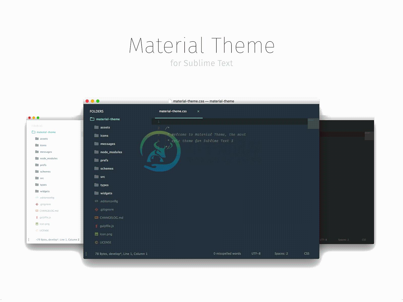
This theme brings the Material Design visual language to your Sublime Text 3. If you have problems, first search for a similar issue and then report a new one.
Please read the Known Issues section before reporting a new one. Any issue that does not use the issue template and any issue related to the known issues section will be automatically closed.
Easy installation
You can install this awesome theme through the Package Control.
- Press ⌘/Ctrl + ⇧ + P to open the command palette.
- Type
Package Control: Install Packageand press enter. Then search forMaterial Theme.
Manual installation
- Download the latest release, extract and rename the directory to "Material Theme".
- Move the directory inside your sublime
Packagesdirectory. (Preferences > Browse packages...)
Activate the theme
You can active this theme from:
- Command palette
Tools > Command Palette(⌘/Ctrl + ⇧ + P) by typingMaterial Theme: Activate theme. - Context menu (Right click on the editor) and choose
Material Theme > Activate Preferences > Packages Settingsand chooseMaterial Theme > Activate
You can also manually activate this theme by adding these lines to your user settings (Preferences > Settings - User):
"color_scheme": "Packages/Material Theme/schemes/Material-Theme.tmTheme",
"theme": "Material-Theme.sublime-theme",
NOTE: Restart Sublime Text after activating the theme.
Configuration
This theme provide a visual configuration tool that allow you to configure the theme by activating the available options from an inline popup. Just right click in your editor and choose Material Theme > Configuration. You can also open the configurator from the command palette by searching Material Theme > Configuration.
Advanced configuration
If you like the advanced text text-configuration you can use it by the Material Theme > Advanced configuration command both from context menu and command palette.
Known issues
Please see the issue #67 if you can't see the bottom panel (find/replace, rename, move, can't see the box inputs in SidebarEnhancement, etc..). here the quick fix:
Addons
File icons
From release 4.0.0 this theme use A File Icon package to display file icons. Please install the package and restart Sublime Text.
App Bar
Material Theme AppbarThis official addon enable a beautiful colored tab bar to your Material Theme. The color tint fits automagically the material theme accent color you choosed.
White panels
Material Theme White PanelsIf you want to enable the white panels and inputs you can install the addon package through Package Control, search for "Material theme white panels". You have to disable it if you want to use the Lighter theme style.
Theme options
// Accent
"material_theme_accent_acid-lime"         : true, // Set acid-lime accent color
"material_theme_accent_blue"              : true, // Set blue accent color
"material_theme_accent_brba"              : true, // Set Breaking Bad green accent color
"material_theme_accent_bright-teal"       : true, // Set bright-teal accent color
"material_theme_accent_cyan"              : true, // Set cyan accent color
"material_theme_accent_graphite"          : true, // Set graphite accent color
"material_theme_accent_indigo"            : true, // Set indigo accent color
"material_theme_accent_lime"              : true, // Set lime green accent color
"material_theme_accent_orange"            : true, // Set orange accent color
"material_theme_accent_pink"              : true, // Set pink accent color
"material_theme_accent_purple"            : true, // Set purple accent color
"material_theme_accent_red"               : true, // Set pale red accent color
"material_theme_accent_sky"               : true, // Set bright-cyan accent color
"material_theme_accent_tomato"            : true, // Set tomato red accent color
"material_theme_accent_yellow"            : true, // Set yellow accent color

// Panels
"material_theme_accent_scrollbars"        : true, // Enable accent color for scrollbars
"material_theme_accent_titlebar"          : true, // Enable accent color for titlebar
"material_theme_bright_scrollbars"        : true, // Bright scrollbars puck color
"material_theme_compact_panel"            : true, // Set minimal padding for the search panel
"material_theme_contrast_mode"            : true, // Enable sidebar and panels contrast mode
"material_theme_panel_separator"          : true, // Show bottom panel separator
"material_theme_small_statusbar"          : true, // Set small status bar
"material_theme_titlebar"                 : true, // Enable title bar (OS X 10.10+)

// Sidebar
"material_theme_arrow_folders"            : true, // Replace folder icons with arrows
"material_theme_big_fileicons"            : true, // Show bigger file type icons
"material_theme_bullet_tree_indicator"    : true, // Set a bullet as active tree indicator
"material_theme_compact_sidebar"          : true, // Set compact sidebar
"material_theme_disable_fileicons"        : true, // Hide sidebar file type icons
"material_theme_disable_folder_animation" : true, // Disable folder animation
"material_theme_disable_tree_indicator"   : true, // Disable sidebar file indicator

// Tabs
"material_theme_bold_tab"                 : true, // Make the tab labels bolder
"material_theme_small_tab"                : true, // Set small tabs
"material_theme_tabs_autowidth"           : true, // Enable autowidth for tabs
"material_theme_tabs_separator"           : true, // Show tabs separator, this disables tab hover animation

// If you use Material Theme - Appbar addon, you can use this setting:
"material_theme_tree_headings"            : true, // Show sidebar headings
Recommended settings for a better experience:
"always_show_minimap_viewport" : true,
"bold_folder_labels"           : true,
"font_options"                 : ["gray_antialias", "subpixel_antialias"], // On retina Mac & Windows
"indent_guide_options"         : ["draw_normal", "draw_active"], // Highlight active indent
"line_padding_bottom"          : 3,
"line_padding_top"             : 3,
"overlay_scroll_bars"          : "enabled",
The font used for the code is "Operator Mono"
You can also use the official Material Design monospace font "Roboto Mono" or "Fira Code".
Contributing
This UI theme uses a custom compiler build on Gulp and JS. If you want to edit the UI you must first install the compiler:
Install the
PackageDevpackage to Sublime Text.Then create a new symlink for the
sublcommand following this guideInstall all the required packages:
$ npm install
- then run compiler and watcher by run:
$ gulp
You can now edit the source files under ./sources folder that will be compiled inside the root folder (don't edit compiled files).
Other Resources
App icon: Download the official Material Theme icon.
Sublime Material Icon Pack: A set of Sublime Text icons heavily inspired by this theme and designed by @halacogluDownload it and enjoy a full Material Theme experience.
Official Portings
Material Theme was also ported to:
- Atom Editor: atom-material-ui (by @silvestreh) and material-ui (by @leo)
- IntelliJ IDEA (thanks to @ChrisRM and @mallowigi).
- Vim (thanks to @kristijanhusak).
- Terminal OSX (thanks to @mvaneijgen).
- iTerm2 (by @Revod) and iTerm2 Palenight (by @jonathanspeek).
- Hyper.
- ConEmu (thanks to @rajadain).
- Slack App ( #263238,#2e3a40,#80CBC4,#FFFFFF,#13191C,#ffffff,#50fa7b,#FF5555 )
- Nylas N1 (thanks to @jackiehluo)
- Base16 (by @ntpeters)
Color Schemes palettes
| Color | Default / Lighter | Darker |
|---|---|---|
| Red | #FF5370 |
#E53935 |
| Pink | #F07178 |
#FF5370 |
| Orange | #F78C6C |
#F76D47 |
| Yellow | #FFCB6B |
#FFB62C |
| Green | #C3E88D |
#91B859 |
| Pale Blue | #B2CCD6 |
#8796B0 |
| Cyan | #89DDFF |
#39ADB5 |
| Blue | #82AAFF |
#6182B8 |
| Purple | #C792EA |
#7C4DFF |
| Violet | #BB80B3 |
#945EB8 |
| Brown | #AB7967 |
#AB7967 |
Thanks
Thanks for all the contributors.
Check the video review by LevelUpTuts
Video review
Support on Beerpay
Hey dude! Help me out for a couple of
-
描述 (Description) 默认情况下,Framework7为应用程序提供22种不同的材质颜色主题。 例子 (Example) 以下示例演示了Framework7中材质颜色主题的使用 - <!DOCTYPE html> <html> <head> <meta name = "viewport" content = "width = device-width, initial
-
Material Design for AngularJS Apps Material Design is a specification for aunified system of visual, motion, and interaction design that adapts across different devices. Ourgoal is to deliver a lean,
-
material-jekyll-theme Demo Getting started git clone https://github.com/alexcarpenter/material-jekyll-theme.git cd material-jekyll-theme Configure the _config.yml file as needed bundle install bundle
-
hexo-theme-material 这个主题最初是为 typecho 而开发的 [typecho-theme-material](https://github.com/viosey/typecho-theme-material)。后来觉得 hexo 用起来更 geek,便移植到 hexo。因为 hexo 开发有极大的自由度,这个主题也变得更加完善。 内置三种主题样式,三种 Markdown 样
-
材料拥有确定不变的特性和固定的行为。了解这些特性将有助于你在一定程度上熟悉材料,这与 Material Design 的构想是一致的。 物理特性 材料具有变化的长宽尺寸(以 dp 为计)和均匀的厚度(1dp)。 (上图)可取 材料的高度和宽度是可变的。 (上图)不可取 材料总是 1dp 厚。 材料会形成阴影。 阴影是由于材料元件之间的相对高度(Z 轴位置)而自然产生的。 (上图)可取 阴影描述材料


