
vue el-table实现自定义表头

本文实例为大家分享了vue el-table实现自定义表头的具体代码,供大家参考,具体内容如下
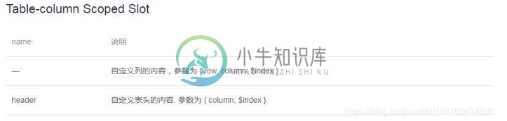
el-table可以通过设置 Scoped slot 来实现自定义表头。
文档说明如下:
代码实现:
<template>
 <el-dialog
  width="50%"
  :visible.sync="isShow"
  :before-close="beforeClose"
  title="自定义设备类型属性">
  <div class="dialogDiv">
   <el-table
    :data="tableData.filter(data => handleAdd || data.name.toLowerCase().includes(handleAdd.toLowerCase()))"
    style="width: 100%" border>
    <el-table-column prop="code"
     :label="$t('basicData.device.propDlg.code')">
    </el-table-column>
    <el-table-column prop="maxValue"
     :label="$t('basicData.device.propDlg.maxValue')">
    </el-table-column>
    <el-table-column prop="minValue"
     :label="$t('basicData.device.propDlg.minValue')">
    </el-table-column>
    <el-table-column prop="name"
     :label="$t('basicData.device.propDlg.name')">
    </el-table-column>
    <el-table-column prop="valueType"
     :label="$t('basicData.device.propDlg.valueType')">
    </el-table-column>
    <el-table-column prop="warning"
     :label="$t('basicData.device.propDlg.warning')">
    </el-table-column>
    <el-table-column align="center" width="160px">
     <template slot="header" slot-scope="scope">
      <el-button v-model="handleAdd"
       size="mini"
       type="success"
       circle plain
       icon="el-icon-plus"
       @click="handleAdd(scope.$index, scope.row)">
      </el-button>
     </template>
     <template slot-scope="scope">
      <el-button
       size="mini"
       type="primary"
       circle plain
       icon="el-icon-edit"
       @click="handleEdit(scope.$index, scope.row)">
      </el-button>
      <el-button
       size="mini"
       type="danger"
       circle plain
       icon="el-icon-delete"
       @click="handleDelete(scope.$index, scope.row)">
      </el-button>
     </template>
    </el-table-column>
   </el-table>
  </div>
  <span slot="footer">
   <el-button @click="cancel">{{ $t('common.cancel') }}</el-button>
   <el-button @click="confirm" type="primary">{{ $t('common.confirm') }}</el-button>
  </span>
 </el-dialog>
</template>

<script>
export default {
 data() {
  return {
   tableData: []
  }
 },
 methods: {
  // 添加
  handleAdd() {
  },
  // 编辑
  handleEdit(index, row) {
  },
  // 删除
  handleDelete(index, row) {
  },
  cancel() {
   this.$emit("cancel")
  },
  confirm() {
   this.$emit("confirm", this.tableData)
  }
 }
};
</script>

<style lang="scss" scoped>
.dialogDiv {
 height: 300px;
 overflow: auto;
}
</style>
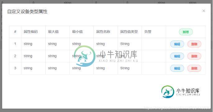
页面效果如下:
以上就是本文的全部内容,希望对大家的学习有所帮助,也希望大家多多支持小牛知识库。
-
本文向大家介绍jQuery实现自定义下拉列表,包括了jQuery实现自定义下拉列表的使用技巧和注意事项,需要的朋友参考一下 html代码: css代码: js(jquery)代码: 虽然代码很简单,但是效果是不是非常酷呢
-
本文向大家介绍Android自定义View实现课程表表格,包括了Android自定义View实现课程表表格的使用技巧和注意事项,需要的朋友参考一下 自己闲下来时间写的一个课表控件,使用的自定义LinearLayout,里面View都是用代码实现的,最终效果如下图,写的可能有问题希望多多指点 创建一个自定义LinearLayout 控件用来装载课程的信息和课程的周数,和节数大概的布局三这样的 根据上
-
如图:需要表头的全选改为文字。如何实现 element-ui版本v2.15.12。 查了很多资料都说没办法实现
-
在开发过程中,常常需要为一些repository方法添加自定义的实现。Spring Data repository允许开发者自定义repository方法。
-
看起来Spring总是使用< code > inmemorrelyingpartyregistrationrepository 来返回一个< code > RelyingPartyRegistrationRepository 类型的bean,请参考https://github . com/Spring-projects/Spring-boot/blob/master/Spring-boot-pro
-
本文向大家介绍Angular2表单自定义验证器的实现,包括了Angular2表单自定义验证器的实现的使用技巧和注意事项,需要的朋友参考一下 本文主要给大家介绍如何判断验证器的结果。在这里,我们就来看看怎样实现一个自定义的验证器。 目标 我们要实现一个验证手机号的验证器,使用的实例还是基于之前的文章里面的实例,也就是用户信息输入的表单页面。我们在手机号的元素上添加一个验证手机号的验证器。然后,如果手