
Bootstrap每天必学之折叠

本文主要来学习一下JavaScript插件--折叠。
1、过渡效果
关于过渡效果
对于简单的过渡效果,只需将transition.js和其它JS文件一起引入即可。如果你使用的是编译(或压缩)好的bootstrap.js文件,就无需再单独将其引入了。
What's inside
Transition.js是针对 is a basic helper for transitionEnd事件的一个基本助手工具,也是对CSS过渡效果的模拟。它被其它插件用来检测当前浏览器对CSS过渡效果是否支持。
2、折叠
对为支持折叠功能的组件,例如accordions和导航,赋予基本样式和灵活的支持。
插件依赖
折叠插件依赖过渡效果插件。
案例
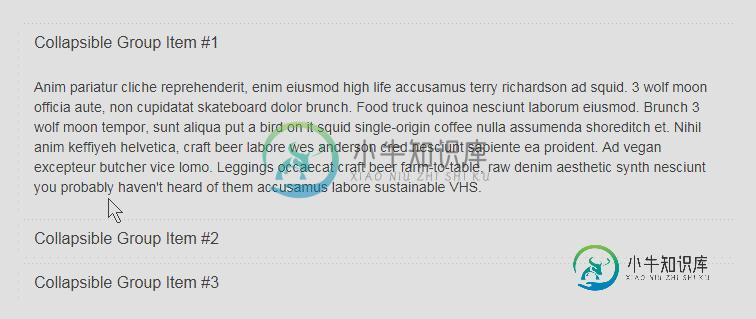
使用折叠插件,通过扩展panel组件从而构建了一个简单的accordion组件。
先来看一下效果。
接下来看一下代码的实现。
<div class="container" style="margin-top:140px;">
 <div class="panel-group" id="accordion">
 <div class="panel panel-default">
 <div class="panel-heading">
  <h4 class="panel-title">
  <a data-toggle="collapse" data-toggle="collapse" data-parent="#accordion" href="#collapseOne"> Collapsible Group Item </a>
  </h4>
 </div>
 <div id="collapseOne" class="panel-collapse collapse in">
  <div class="panel-body"> Anim pariatur cliche reprehenderit, enim eiusmod high life accusamus terry richardson ad squid. 3 wolf moon officia aute, non cupidatat skateboard dolor brunch. Food truck quinoa nesciunt laborum eiusmod. Brunch 3 wolf moon tempor, sunt aliqua put a bird on it squid single-origin coffee nulla assumenda shoreditch et. Nihil anim keffiyeh helvetica, craft beer labore wes anderson cred nesciunt sapiente ea proident. Ad vegan excepteur butcher vice lomo. Leggings occaecat craft beer farm-to-table, raw denim aesthetic synth nesciunt you probably haven't heard of them accusamus labore sustainable VHS. </div>
 </div>
 </div>
 <div class="panel panel-default">
 <div class="panel-heading">
  <h4 class="panel-title">
  <a data-toggle="collapse" data-toggle="collapse" data-parent="#accordion" href="#collapseTwo"> Collapsible Group Item #2 </a>
  </h4>
 </div>
 <div id="collapseTwo" class="panel-collapse collapse">
  <div class="panel-body"> Anim pariatur cliche reprehenderit, enim eiusmod high life accusamus terry richardson ad squid. 3 wolf moon officia aute, non cupidatat skateboard dolor brunch. Food truck quinoa nesciunt laborum eiusmod. Brunch 3 wolf moon tempor, sunt aliqua put a bird on it squid single-origin coffee nulla assumenda shoreditch et. Nihil anim keffiyeh helvetica, craft beer labore wes anderson cred nesciunt sapiente ea proident. Ad vegan excepteur butcher vice lomo. Leggings occaecat craft beer farm-to-table, raw denim aesthetic synth nesciunt you probably haven't heard of them accusamus labore sustainable VHS. </div>
 </div>
 </div>
 <div class="panel panel-default">
 <div class="panel-heading">
  <h4 class="panel-title">
  <a data-toggle="collapse" data-toggle="collapse" data-parent="#accordion" href="#collapseThree"> Collapsible Group Item #3 </a>
  </h4>
 </div>
 <div id="collapseThree" class="panel-collapse collapse">
  <div class="panel-body"> Anim pariatur cliche reprehenderit, enim eiusmod high life accusamus terry richardson ad squid. 3 wolf moon officia aute, non cupidatat skateboard dolor brunch. Food truck quinoa nesciunt laborum eiusmod. Brunch 3 wolf moon tempor, sunt aliqua put a bird on it squid single-origin coffee nulla assumenda shoreditch et. Nihil anim keffiyeh helvetica, craft beer labore wes anderson cred nesciunt sapiente ea proident. Ad vegan excepteur butcher vice lomo. Leggings occaecat craft beer farm-to-table, raw denim aesthetic synth nesciunt you probably haven't heard of them accusamus labore sustainable VHS. </div>
 </div>
 </div>
 </div>
 </div>
第一步:首先最外面那层panel-group这层下面包括几个小组。
第二步:看一下几个简单的组
<div class="panel panel-default">
 <div class="panel-heading">
 <h4 class="panel-title">
 <a data-toggle="collapse" data-toggle="collapse" data-parent="#accordion" href="#collapseOne"> Collapsible Group Item #1 </a>
 </h4>
 </div>
 <div id="collapseOne" class="panel-collapse collapse in">
 <div class="panel-body">
 </div>
 </div>
</div>
通过代码也比较清楚的可以看出一个panel的结构。
panel-header和pandl-body,然后panel-header里面可以包含标题,链接。通过链接和panel-body相连。
第三步:你可以发现在panel-group中有一个id="accordion",然后下面每个标题下链接中有个data-parent="#accordion"。
如果去掉的话,那么效果就是点击其他链接后,原来的panel并不会再缩起来了。
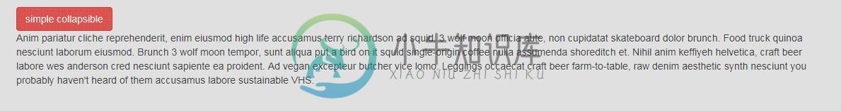
你可以通过另一个方式来展示折叠的效果。
 <div class="container" style="margin-top:140px;">
 <button type="button" class="btn btn-danger" data-toggle="collapse" data-target="#demo"> simple collapsible </button>

<div id="demo" class="collapse in">Anim pariatur cliche reprehenderit, enim eiusmod high life accusamus terry richardson ad squid. 3 wolf moon officia aute, non cupidatat skateboard dolor brunch. Food truck quinoa nesciunt laborum eiusmod. Brunch 3 wolf moon tempor, sunt aliqua put a bird on it squid single-origin coffee nulla assumenda shoreditch et. Nihil anim keffiyeh helvetica, craft beer labore wes anderson cred nesciunt sapiente ea proident. Ad vegan excepteur butcher vice lomo. Leggings occaecat craft beer farm-to-table, raw denim aesthetic synth nesciunt you probably haven't heard of them accusamus labore sustainable VHS.</div>
用法
折叠插件通过几个简单的类来控制样式
.collapse 隐藏内容
.collapse in 显示内容
.collapsing。 It is added when the transition starts, and removed when it finishes意思大概可能就是折叠被添加后过渡效果就有了,然后如果被移除了它就结束了。
通过data属性
仅仅通过向页面元素添加data-toggle="collapse" 和data-target就可以为其赋予控制可折叠页面元素的能力。data-target属性接受一个CSS选择器作为其控制对象。请确保为可折叠页面元素添加collapse class。如果你希望可折叠页面元素的默认状态是展开的,请添加in class。
为了给一组可折叠页面元素添加控制器,添加data-parent="#selector"即可。请参考上面的例子即可。
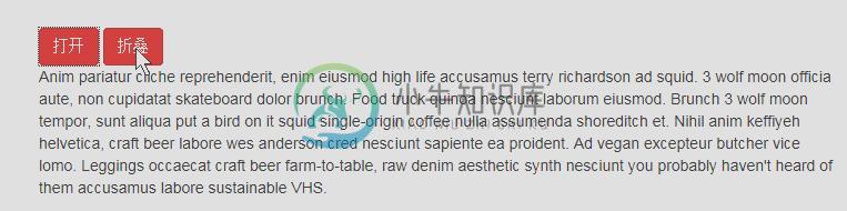
通过JavaScript
<button type="button" class="btn btn-danger" onClick="Open()">打开</button>
<button type="button" class="btn btn-danger" onClick="Hide()">折叠</button>

<div id="demo" class="collapse in">Anim pariatur cliche reprehenderit, enim eiusmod high life accusamus terry richardson ad squid. 3 wolf moon officia aute, non cupidatat skateboard dolor brunch. Food truck quinoa nesciunt laborum eiusmod. Brunch 3 wolf moon tempor, sunt aliqua put a bird on it squid single-origin coffee nulla assumenda shoreditch et. Nihil anim keffiyeh helvetica, craft beer labore wes anderson cred nesciunt sapiente ea proident. Ad vegan excepteur butcher vice lomo. Leggings occaecat craft beer farm-to-table, raw denim aesthetic synth nesciunt you probably haven't heard of them accusamus labore sustainable VHS.</div> <div class="panel-group" id="accordion" style="margin-top:240px;">
 <script type="text/javascript"> $(function(){
  $("#demo").collapse({
 toggle: false })
 })
 function Open(){
 $("#demo").collapse("show");
 }
 function Hide(){
 $("#demo").collapse("hide");
 } </script>
来看一下上面的效果
方法
赋予页面元素可折叠功能。接受一个可选的object作为参数。
$("#demo").collapse({toggle: false})
这样元素在初始化的时候会是展开的。
1.collapse('toggle')展示或隐藏一个可折叠的页面元素。
2.collapse('show')展示一个可折叠页面元素。
3.collapse('hide')隐藏一个可折叠页面元素。
事件
Bootstrap中的折叠插件对外暴露了一组可以监听的事件。
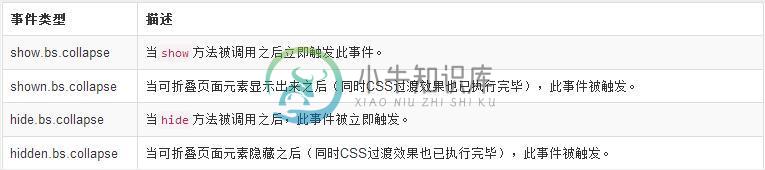
这样就为元素绑定了隐藏时的事件。
如果大家还想深入学习,可以点击这里进行学习,再为大家附两个精彩的专题:Bootstrap学习教程 Bootstrap实战教程
以上就是本文的全部内容,希望对大家的学习有所帮助。
-
本文向大家介绍Bootstrap每天必学之折叠(Collapse)插件,包括了Bootstrap每天必学之折叠(Collapse)插件的使用技巧和注意事项,需要的朋友参考一下 折叠(Collapse)插件可以很容易地让页面区域折叠起来。无论您用它来创建折叠导航还是内容面板,它都允许很多内容选项。 如果您想要单独引用该插件的功能,那么您需要引用 collapse.js,或者,正如 Bootstrap
-
本文向大家介绍Bootstrap每天必学之表单,包括了Bootstrap每天必学之表单的使用技巧和注意事项,需要的朋友参考一下 本文主要讲解的是表单,这个其实对于做过网站的人来说,并不陌生,而且可以说是最为常用的提交数据的Form表单。本文主要来讲解一下内容: 1.基本案例 2.内联表单 3.水平排列的表单 4.被支持的控件 5.静态控件 6.控件状态 7.控件尺寸 8.帮助文本 基本案例 单独
-
本文向大家介绍Bootstrap每天必学之按钮(一),包括了Bootstrap每天必学之按钮(一)的使用技巧和注意事项,需要的朋友参考一下 本文主要讲解的是按钮的样式。 1.选项 2.尺寸 3.活动状态 4.禁用状态 5.可做按钮使用的Html标签 选项 使用上面列出的class可以快速创建一个带有样式的按钮。 尺寸 需要让按钮具有不同尺寸吗?使用.btn-lg、.btn-sm、.btn-xs
-
本文向大家介绍Bootstrap每天必学之js插件,包括了Bootstrap每天必学之js插件的使用技巧和注意事项,需要的朋友参考一下 1、Bootstrap 插件概览 在前面 布局组件 章节中所讨论到的组件仅仅是个开始。Bootstrap 自带 12 种 jQuery 插件,扩展了功能,可以给站点添加更多的互动。即使您不是一名高级的 JavaScript 开发人员,您也可以着手学习 Bootst
-
本文向大家介绍Bootstrap每天必学之下拉菜单,包括了Bootstrap每天必学之下拉菜单的使用技巧和注意事项,需要的朋友参考一下 一、下拉菜单(基本用法) 小伙伴们注意,在Bootstrap框架中的下拉菜单组件是一个独立的组件,根据不同的版本,它对应的文件: ☑ LESS版本:对应的源码文件为 dropdowns.less ☑ Sass版本:对应的源码文件为 _dropdowns.sass
-
本文向大家介绍Bootstrap每天必学之滚动监听,包括了Bootstrap每天必学之滚动监听的使用技巧和注意事项,需要的朋友参考一下 本文为大家介绍Bootstrap滚动监听,供大家学习,具体内容如下 1. Scrollspy currently requires the use of a Bootstrap nav component for proper highlighting of ac